The Halo Effect is a well-documented social-psychology phenomenon that explains how individuals make rapid judgments. What does the Halo Effect have to do with mobile app development? A lot!
Before users consume your compelling copy or marvel at your app’s spectacular animations, they will notice the icon and then the user interface. If your color selections aren’t appealing and don’t resonate with users, they will quickly develop a negative perception without ever using the app.
This makes your mobile app color choices, arguably, the most important decision you will make. As such, it makes dollars and sense to strategically select colors based on the psychology of colors and your target audience. When you do, you can create an intentional, highly effective mobile app UI design best positioned to drive users toward the desired action. Let’s explore the importance of choosing the best colors for app development and a few color scheme approaches.
The Importance of Choosing the Right Color Scheme
In mobile app design, the color scheme anchors your user interface (UI). Although many app developers think of the user experience strictly in terms of functionality—like call to action (CTA) button placements and other app UI elements—color selection can be equally important. Here’s why:
- Encourage goal completions. Whether you want to drive user engagement or traffic to affiliate ads, the right colors can guide users to the right action. For example, HubSpot research suggests a red call to action (CTA) outperforms green CTAs by 21%.
- Promote brand recognition. Colors can bolster brand awareness by up to 80%, etching your brand in the hearts and minds of users.
- Influence mobile app profitability: With the ability to influence 85% of a user’s purchase decisions, color choices can help nudge your app toward profitability.
- Call out specific elements. Want to ensure your users focus on certain UI elements? Use the right color scheme to do so.
- Convey structure. Users want a frictionless mobile app experience. Colors can create a hierarchy, making it easier for users to navigate your mobile app.
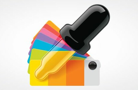
Your color selection can be a powerful amplification tool for your app. It helps users interact with UI elements, interpret content, and complete the desired action. Because of this, it’s vital to use a mobile app development tool that makes color selection easy and intuitive.
Color Theory 101
In the 17th century, Sir Isaac Newton developed the color wheel theory by splitting white light into a spectrum with a prism. His perspective paved the way for red, yellow, and blue to be primary colors.
Today, humans can see 1000 shades of light, 100 red-green levels, and 100 levels of yellow-blue. Psycho Physicists estimate there are around 10,000,000 shades of color. They all stem from 11 primary colors. Let’s explore the meaning of each:
- Red is a color that elicits intense emotions, spanning from heat and anger to sexuality. Red is energetic, bold, and lively, which makes it the perfect way to deliver strength, power, and confidence to your brand.
- Yellow is a vibrant, bright, joyous, and cheerful color that captures the brilliance of sunshine. It’s the most visible color from a distance.
- Orange blends the joy of yellow and the warmth of red to communicate energy and activity. Because of its fruity namesake, orange naturally feels healthy and fresh.
- Green gets its name from the Anglo-Saxon word “grene”—which means “grow” and “grass”— so the color exudes a natural and environmental sense. Green is also the color of money and can be associated with stability and wealth.
- Blue is a versatile color palette and has long been associated with nature (think blue sky) and art. Blue also helps to convey trustworthiness, reliability, and communication.
- Purple is associated with nobility, royalty, luxury, and majesty. It can exude a mysterious or spiritual quality, while lighter shades blanket sentimentality and nostalgia.
- Pink is feminity, which explains the connection between women’s products and breast cancer.
- Brown can help users feel orderliness, wholesomeness, and a more natural and organic feel. Brown is simple, strong, and can express the genuineness of your brand.
- Gray sits on the pinnacle of humility, sophistication, and professionalism. With well-meaning intentions, gray demonstrates authority.
- Black is a bold and duplicitous color, exuding power, luxury, and exclusivity. It can also convey death and mystery.
- White represents the positive attributes of purity, cleanliness, and innocence. On the other hand, white can be impersonal, cold, and sterile.
How to Select the Best Colors for Your App
Color is the second most impactful aspect of your mobile app, after functionality. All human-to-smartphone interactions hinge on UI design and UI elements. Your primary, background, and complementary colors play an essential. For accessibility, your color combinations affect readability and legibility, while allowing users to digest content. Here are a few fundamental best practices when implementing color in your app UI.
1. Familiarize Yourself with Color Psychology
For your mobile app, it’s important to use color psychology to create a stylish, attractive, engaging, and accessible user interface. Color psychology studies how a color palette impacts behaviors, emotions, and preferences. Understanding the basics and common associations of colors can help you align the right colors with your brand to convey your app’s personality. According to a color associations survey, here’s how respondents associated colors with specific words:
- 34% associate trust and blue.
- 28% connect security with blue.
- 76% align speed with red.
- Orange (26%) and yellow (22%) are associated with cheapness.
- 43% associate black and premium quality, while 0% connect quality and orange.
- 26% relate black and high tech, while 23% connect it with blue and gray.
- 28% and 26% associate fun with orange and yellow, respectively.
Leveraging this information, you can strategically select the right primary colors, secondary colors, and color combinations that align with the purpose of your app and the emotions you want it to elicit.
2. Consider Your Brand Color & Identity
Your brand is everything. You must capitalize on every opportunity to promote and reinforce it. Because of this, your primary brand color should be the first color in your app’s color element. By using your brand hue as the primary color, you can associate positive emotions the app generates with your brand.
3. Look at Complementary Color Combinations
Once you have the primary brand color, a complementary color is often an ideal choice as the second color in your mobile app’s color palette. You can use a scheme generator or color wheel to help you strategically select the perfect orchestra of colors. One option may be to find high-contrast colors to offset and highlight valuable UI elements. Many app developers limit the hues in the color palette to three to five, which can help reduce clutter and avoid visual confusion.
4. Select Background Colors
The background color you choose is fundamental to creating high-contrast content. Your background colors will be the third and fourth colors in your app’s color palette. One rule of thumb is if you choose a dark background, choose lighter-colored content, and vice versa.
5. Pick Typeface Colors
The typeface colors you choose should contrast with your background and sync with other app UI elements. For example, use a light typeface with a dark background and darker typeface colors for lighter backgrounds. Although white text on a black background creates high contrast, it’s less readable. It often causes more eye fatigue than black text on a white background. Any light-colored text on a black background can cause eye fatigue.
Need Help? Use Online Tools to Pick the Perfect Color Palette
Choosing colors can be challenging, especially when considering accessibility, readability, legibility, and color saturation. Because of this, several tools are available to help you choose the best color code for your app. These are some of our favorites:
- Coolors — You input your brand color, and Coolors will automatically help you choose matching colors.
- Color Safe — It’s an easy-to-use tool that generates web-accessible color palettes.
- Color Palette Contrast Checker — This tool will automatically scan your colors for adherence to accessibility standards and requirements.
2023 Color Trends in Mobile App Design
Staying up on the latest color trends can ensure your app design is fresh, modern, vibrant, and dynamic. We’ve outlined the most popular color trends in mobile app design for 2023. Check them out:
Bright Colors
Looking to make your mobile app stand out from the crowd? A vivid splash of bright colors will do the trick. Bright color schemes are all about making a bold and dynamic statement with different colors. It uses saturated and bright hues as the primary colors in the design instead of just accents. To separate elements, you can always rely on high-contrast scenarios.
One excellent example of an app that embraces a bright and vibrant color scheme is the Cleo app. This digital banking app is like no other, and app developers have successfully used the bright color palette to align their brand with the edginess it needs.
Pastel Colors
As smooth and gentle as ever, pastels are delightful. These soothing colors offer the best of both worlds: the vividness of bright color without the offensiveness. Pastels are primary or secondary colors with more white in the mix, offering high brightness but low saturation.
Pastels are on the opposite spectrum of bold and vibrant colors, offering a more toned-down hue. These gentle shades are the perfect color scheme for the mindful and meditation app Headspace. The soothing nature of pastel colors helps the Headspace app put users in a peaceful, relaxed state of mind.
Muted Colors
If you’re driving through a new neighborhood with the radio at full blast, what’s the first thing you do when trying to think and find a house number? You turn down or mute the radio. Muted color schemes can help you do just that—they help you calm down and focus. Muted color schemes are very similar to pastel colors, being they have low saturation. Instead of a white undertone, muted color schemes are tampered with darker colors, like black, gray, or brown. The result is a milder, less vivid color that perfectly contrasts vibrant colors. Muted colors are perfect in apps that require a softer feel or a more serious tone, like the Partly Cloudy mobile weather app.
Minimalist Colors
The minimalist color scheme works to decrease visual clutter and help the user concentrate on UI design elements. It uses the least amount of colors to prevent muddying the screen. However, this doesn’t mean you are limited. Minimalism designs often feature multiple strategically positioned colors.
Neutrals like black, taupe, and gray are perfectly exploited in minimalist designs. You can even include muted accent colors in the blush pink, green, and blue palette. The key to minimalist color schemes is to keep the color palette largely monochromatic with slight tweaks in tone and shade.
Monochromatic Colors
While minimalist works on less is more, monochromatic color schemes are all about the versatility of a single color. Monochromatic color schemes use one color and different variations of this color by altering the brightness and saturation of the base color. The overarching benefit of the monochromatic approach is you can always strike perfect harmony in your design. At the same time, this approach is efficient. For example, if blue was your base color, accent colors could be lighter blues or blues with tints, and the main focal points, like the call to action (CTA), can be a bolder blue to attract the user’s focus and attention. The simple design of monochromatic schemes helps users process your user interface quickly.
Gradient Color
The gradient color scheme refers to romantic, seductive, and mysterious transitions from bright to dark, dark to bright, shallow to deep, or across colors. You don’t have to look far for a picturesque example of an app that uses gradients: Instagram. Notice how the logo starts with a bright fuchsia color, deepens into a red, and brightens out with an orangish-yellow color. Gradients can be used on virtually any existing color palette, making it more dynamic and intriguing.
Analogous Colors
Analogous colors are a group of three hues situated next to each other on a color wheel. For example, when violet, violet-red, and red are grouped, it’s called an analogous color scheme. The analogous color approach offers a calming and pleasing user experience. The one downside to this color scheme is it often lacks contrast because the colors are closely related. The trick is to leverage sufficient contrast when appropriate.
Triadic Colors
While analogous color schemes promote calmness, the triadic color scheme is about vibrance and excitement. It’s comprised of three evenly spaced colors on a traditional color wheel. The balanced triadic color approach hones in on one dominant color, while the other two evenly spaced colors are accents. Regardless of colors, triadic color schemes pop and present a lively pallet. Even so, triadic color schemes offer balance and harmony when used together.
Complementary Color Scheme
Sweet and salty, black and white, an extrovert and an introvert — sometimes opposites attract and work perfectly together, which explains the complementary color scheme. The complementary color scheme uses two colors opposite of each other on the color wheel to create a high-contrast color combination that pops. Popular examples of high-contrast complementary color combinations are:
- Yellow and purple
- Red and green
- Green and magenta
- Orange and blue color
You can modify the complementary color scheme by throwing in a third color, which is the split complementary color scheme. Doing so can slightly tone down the pitch of your app’s user interface. The split complementary color scheme uses one color as the base and two adjacent colors as its complement.
Selecting Your App Colors in Shoutem
While choosing the best mobile app colors and schemes can be challenging, implementing your color choices is easy with the Shoutem app development tool. Designed for everyone, Shoutem is a powerful web app that makes customizing mobile app colors as easy as clicking the section and choosing your colors. With Shoutem, you can quickly customize every facet of your mobile app, including
- Theme-level changes,
- Individual items,
- Individual sections, such as social media
- And more
Want to learn more? Watch our quick tutorial on how to edit mobile app colors in Shoutem.
Start a Free 14-day Trial of Shoutem
Today, having a mobile app isn’t nice to have—it’s essential. Whether you’re a business owner or someone looking to monetize app development, Shoutem makes Android or Apple iOS app development a hassle-free, drag-and-drop affair. While mobile app development traditionally has required JavaScript, Kotlin, and extensive coding knowledge, Shoutem is the premier no-code web app tool. With a sleek and easy-to-use interface, Shoutem allows you to create a mobile app without coding or editing a single line of code. When you’re done, Shoutem seamlessly publishes to the Android or Apple app store with a click of a button.
Best of all, it’s effortless to get started with Shoutem’s free 14-day, hassle-free trial. Start building your app today!