Even though a mobile user interface might be one of the last steps for an app-building process, it’s the first thing users encounter. As a result, the first impressions are 94% design-related.
To design a good and exciting UI, designers have to be familiar with user interface design principles, work with multiple design tools, and catch on to the current trends.
Considering all that, making an app with a great UI seems intimidating. In this article, you’ll find steps and explanations to simplify mobile UI and user interface design principles and clarify any possible doubts you have.
What is Mobile User Interface (Mobile UI)?
Mobile user interface or mobile UI is the way an app feels and looks while using the app. It’s a bridge between your users and the app itself. UI is one of the final phases of app development and an essential part of user experience. It’s all about creating an enjoyable and friendly experience for the user. It’s a key to the success of your app.

Why Mobile User Interface is Important for Users & List of 7 Benefits
According to studies, smartphone owners, on average, actively use nine applications on their devices, launching them up to 300 times a day.
Those apps must have a proper mobile UI. That’s the only aspect of the app the end-users see.
With Shoutem’s Android and iPhone app builder It should be designed clearly, with user interface design principles in mind. This way, it will be more user-friendy, a thus, more popular amongst them.
Mobile UI is, above all, important because it shows your product, in this case, an app, appealingly and engagingly to your audience.
7 Good Mobile UI Benefits
- Eases the interaction between the user and the app
- Attracts the user
- Improves conversion rate
- Engages the user
- Provides information about the app
- Provides constant revenue
- It makes the app fun and easy to use

7 Rules and Patterns for Mobile User Interface Button Design
Every mobile app has buttons. Unfortunately, those cute-looking and practical buttons that users love can be a nightmare for a developer. It’s not at all rare to have mobile button design botches like broken links, absence of visual feedback, and unresponsive or unclickable buttons.
There are some button design rules that can help you design better problem-free buttons.
Stick to the core UI design principles
Accessibility is the priority when designing a button. And if you want an accessible button, it has to have the right shape, size, and padding.
Shape – depends. For example, in android UI, a flat and raised material button has to be 36dp high, have a minimum width of 88dp, and have a 2dp corner radius (flat).
Size – for optimal usability and information density, Android’s Material Design advises that touch targets should be at least 48 x 48dp, with at least 8dp (or more) between them.
Padding – that’s the white space around components or content. There should be enough of it, so the users don’t get overwhelmed.
A colorful button is a good button. Color, especially contrasting colors, attracts the user and encourages them to take action. Colors are also a part of your brand identity. Therefore, users will associate the color palette you choose to use in the user interface with your brand.
When contrasting buttons, stick to the basic rules. Use low contrast for neutral actions, medium contrast for negative actions, and high contrast for positive actions.
Help users prioritize tasks by removing friction on-screen
Removing friction is one of the most important things to do. It’s essential to help users prioritize tasks. With layering, relief, and subtle shadow, you can make the 3D illusion, even on a flat screen. If you add highlights between primary and secondary buttons, the user is more likely to notice the CTA button click it.
Reward users with visual feedback
Users love excellent visual feedback. It helps them know if they’re doing something right or wrong. A perfect time to provide some visual feedback is right before the user clicks on the primary button.
Offer a free trial or sign up for the newsletter. When making visual feedback, make sure the buttons change colors as the action is accepted. In addition, some animation and motion will engage users more.
Like in life, location, position, and order are crucial, so make sure to put them in the user’s path where they can find them. If you’re making an iOS UI design, buttons must be precise and placed, so they are easy to scan and communicate the task’s priority.
When it comes to Android, it’s recommended to put one floating action button per screen to represent the most common action and emphasize its importance. In any case, use a UI pattern that compliments your content most.
For example, the F design pattern is commonly used for web content, but it may not be good for the mobile device app.
Be consistent with defining design trends as well as your UI design
While it is admirable that you want to save users a few clicks with your design, it may not be such a good idea. Above all, users love consistency. So it’s best to have consistent UI buttons. That way, users will identify them with actions and click-through.
There’s nothing more annoying for a user than a button than not knowing which button to click for further action. Make clear and distinct labels for your buttons, especially for the most important one, the CTA button.
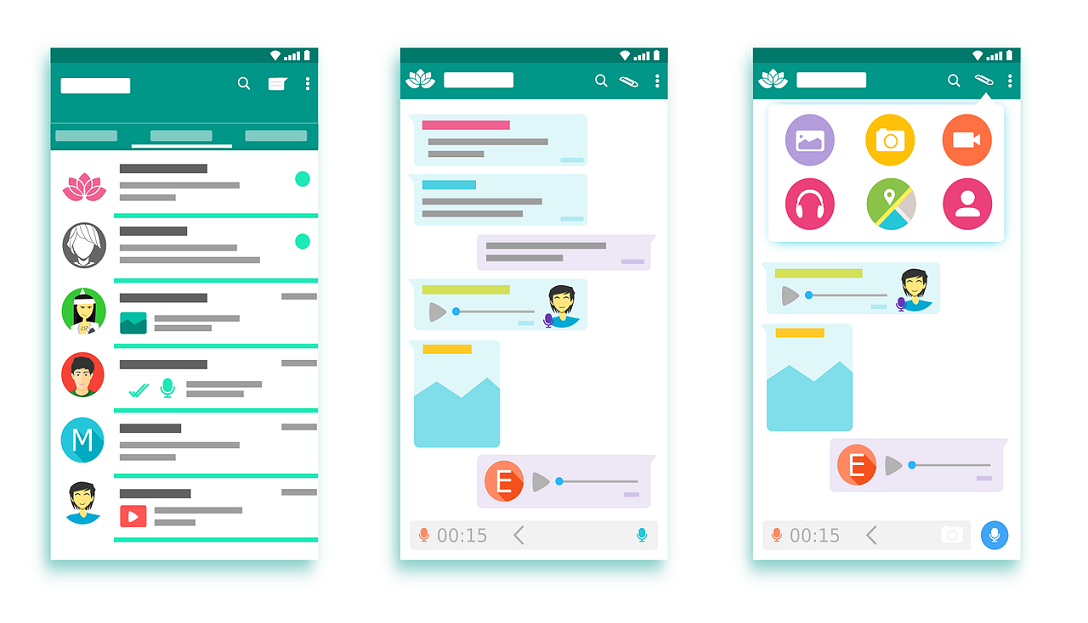
Mobile UI Design Examples
When developing a UI, most people need some inspiration. Some mobile UI designs are so recognizable that they inspire other app developers with their simple ingenuity.
We’ll show you two well-known examples of just how vital a good mobile UI design is. Inspire yourself with their design principles, a palette of colors…

Tinder
The original dating app, the one that started it all. Its seemingly simple yet clearly effective design has stayed on top for years now. The whole structure is so simple because it needs to take users from one point to another quickly. Multiple screens are used when registering, but each is minimalistic and not distracting, which users seem to love more than just one screen overcrowded with info.
Their cards stocks are also focused on one person at a time, so users don’t get distracted. In addition, Tinder uses in-app gestures to any screen complications and unnecessary buttons. And, as with every good app, they use the reuse principle, which can be seen when swiping the screen right for both matches and messages.
Glovo
Just like Tinder, one of the first and most famous food delivery apps. Glovo has three types of users, the customer, the courier, and partners (restaurants, stores…). Because of the different contexts in which they use the app Glovo has customized the app. For customer app provides entertaining downtime, for courier it has large font, and for partners, it shows orders in real-time, with an opinion to accept or decline.
The colors they use also help with the user experience. The famous yellow and green combination is contrasting enough. They use that color palette throughout the app, especially on buttons strategically placed on the screen.
How to Measure Your UI Designs? Testing Your Designs
Everybody is always working on improving the UI design and working on better app functions because it contributes to better revenue and growth.
There are six main metrics you can use to measure just how successful is your app:
- Task Success Rate
- Task Completion Time
- Conversion Rate
- Error Rate
- User Satisfaction
- Retention Rate
How to Improve Your Mobile User Interface
All good business owners want the best for their users. Studies show that consistent branding increases revenue by 23% on average.
To make your user happy, you constantly have to improve your UI design and follow the changing user requirements.
There are a few ways to improve UI designs:
- Study Others Designs
- Practice Everyday
- Define Your Elements
- Improve Contrast
- Text Alignment
Mobile UI Design Trends 2022
67% of global app users today uninstall an application due to its poor user interface. We would also add, due to outdated user interface design. Design trends are constantly changing, so the best way to make good mobile designs is to look for new trends continually.
Here we have brought together a few of the mobile UI design trends of 2022 that will keep your app relevant:
- Boost user experience with in-app gestures
- Video and animation
- Chatbots and conversational design
- Augmented reality in UI design
- Neutral interfaces and content-focused experiences
- Illustrations
- Serif fonts
- Futuristic color
Bonus Tip: Best Mobile UI Design for Login
While most developers don’t pay too much attention to the design of a login screen, it’s just as important as the home screen. After all, it’s the first thing users encounter after downloading the app.
For that reason, the login screen should always be simple, intuitive, and never overcrowded. Make sure all the fields are visible and clean.
When making a sign-up and sing in button, separate them. Putting them too close together can have a confusing impact on users.
Another helpful tip is to make the password visible to decrease mistyping. You can do that by including the “show password’ checkbox or icon.
When signing in/up, users are often asked a username. This tends to be annoying and time-consuming. Ask the users for their email or phone number instead.
And last but not least important tip is to include the ‘Forgot Your Password’ link in the login screen as users tend to forget passwords more often than you think.
Mobile User Interface FAQ
What makes a good mobile UI?
A good mobile UI is composed of many things, but its primary goal is to make appealing and engaging designs for your target audience. Therefore, you should watch out for the color palette, multiple design principles, consistency, clarity, and above all, good user experience.
What does UI stand for?
UI stands for the user interface, which is how an app looks in its final development phase.
How much does mobile UI design cost?
Mobile UI design costs anywhere from $1500 to $30000, depending on the complexity and the developer’s rate.
How many hours does it take to design an app?
An app can take anywhere from a week for the most simple ones to make to months.
Additional resources: